PowerPoint

PowerPoint documents are easy to make accessible, but how they are designed and presented can make a big difference for students with disabilities. If you've used the accessibility features in Microsoft Word, PowerPoint’s accessibility features will be familiar.

Accessibility Features

Accessibility features for PowerPoint can be viewed in your task bar by using the accessibility checker.

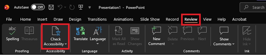
You can find the Accessibility Checker in the Review tab.

PowerPoint interface focused on Review tab highlighting accessibility tools. Key elements include Check Accessibility button outlined in red and Review tab also outlined, emphasizing features for proofreading and comments management.

Once opened, the Accessibility tab will be available in the quick access toolbar, and the Accessibility Assistant will appear to the right of your slide. This assistant will be automatically updated as you create your PowerPoint, reporting any issues that it detects.

There are two primary ways to modify alt text in PowerPoint.

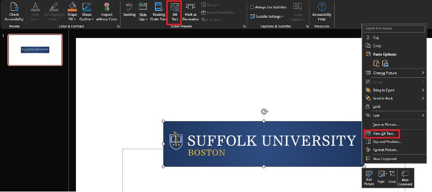
1. Right click the image and select “View Alt Text” or click the Alt Text button in the Accessibility tab.

PowerPoint interface showing a selected text box with "SUFFOLK UNIVERSITY BOSTON" and a context menu open with options including "View Alt Text." The interface highlights accessibility tools, emphasizing steps to add or view alternative text for images or objects within a presentation.

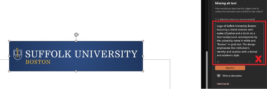
2. In the accessibility assistant, you can click the “Missing alt text” error and it will let you go through each image that doesn’t have alt text and allow you to add it.

PowerPoint allows you to generate alt text for your images automatically. This feature is a good place to start (especially if you are including charts in your PowerPoint) but will often generate alt text that isn’t helpful or is too verbose.

The alt text example provided is "Logo of Suffolk University Boston featuring a shield emblem with scales of justice and a torch on a blue background, accompanied

Alt text should primarily focus on usability and avoid flowery descriptions. Be direct and to the point, and don’t hesitate to mark images as decorative if their inclusion isn’t critical to understand a slide.

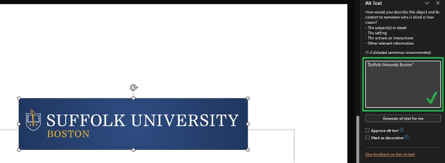
For images of text, alt text should simply be the text in quotation marks. Though try to avoid images of text whenever possible.

A logo banner featuring "Suffolk University Boston" with a blue background and white and gold text. The design includes a shield emblem on the left side, symbolizing the university's identity.

See our suggestions on how to make good alt text on the Accessible Content Guide page.

The Accessibility Assistant that opens when you check your document for accessibility will help monitor your color contrast, but PowerPoint also has a tool for you to visually check for poor contrast as well.

oftware interface showing a toolbar with various editing and accessibility options. The toolbar includes icons and labels for functions like Check Accessibility, Font Color, Text Highlight Color, Shape Fill, Shape Outline, and Inspect without Color, with Inspect without Color highlighted by a red box.

By using the “Inspect without Color” tool you can view your document in grayscale, letting you more easily pick out areas where your document may not be legible.

It is usually easy to maintain good color contrast in PowerPoint though, especially if you use any of the program’s preset designs. The preset designs have compliant contrast by default.

For navigational purposes, each of your slides need to have a unique title. This allows students to find content more easily, especially those using assistive technology.

By default, all of PowerPoint's slides come with a title bar. Try to avoid deleting or duplicating that bar when designing your slides.

Tables generated within PowerPoint are automatically accessible, but there are a couple of things you should keep in mind when using tables.

  • Avoid splitting or merging cells. Splitting and merging cells can make tables unintuitive for screen reader users. Consider putting information like titles and footnotes outside of the table instead of in a split cell.
  • Be aware of your headings. Heading cells are the cells at the top or side of a table that provide context, and they are necessary for assistive technology to interact with tables properly. PowerPoint will default to making the first row of the table your heading cells, but this can be adjusted in the table design tab that will appear in the quick access toolbar while a table is selected.

    software interface showing Table Design tab in a spreadsheet application. The tab includes options for Table Style Options like Header Row, Total Row, Banded Rows, and Table Styles with various color-coded style previews.
    Under table style options, you can use the first four checkboxes to determine which cells will be your heading cells. “Header Row” will make the first row into a heading while “Total Row” will make the last row into a heading. “First Column” and “Last Column” will make those columns into headings as well. These options can be mixed and matched.|

    PowerPoint’s Accessibility Assistant will not always know if your headings are correctly located, so this is a good thing to check manually.
  • Tables should only be used as tables, not as visual design elements. If you want to precisely position text in your document or add borders around it, consider inserting a text box instead of a table.

Best Practices

Text

Because PowerPoints are often presented in person, font choice and font size are especially important. The easier it is to visually process your text, the more your audience will retain from your presentation. Here are three things to think about when designing your slides:

  • Font size, which should never be smaller than 18pt across your presentation. Any smaller than that, and you risk it being difficult to read. It’s recommended to stay around 24pt font for paragraph text. PowerPoint will automatically reduce your font size to fit into a text box by default, so make sure to keep an eye on it as you create your slides. If your text is getting too small, it may be a good idea to split your discussion points across shorter slides.
  • Spacing is critical to your audience’s understanding of the materials you are presenting. Too much text clumped together can be difficult for students to pick apart, and this is especially true for those with disabilities. Though PowerPoint defaults to paragraphs without spacing breaks, you can easily add space when making a new paragraph by holding shift, pressing enter, releasing shift, and then pressing enter again.
  • Font choice, which you can read more about on the Accessible Content Guide page is an easy way to make your text more readable. Simply avoiding serif fonts for paragraph text, and you can greatly improve your slides’ readability.

Preparation

One of the best things to do ahead of a presentation is to provide a digital copy of your PowerPoint to your audience.

Your PowerPoint does not need to be provided significantly ahead of time or be designed to be viewed in a vacuum; simply having the PowerPoint can help your audience follow along more easily.

For instance, notetaking software can often integrate PowerPoint documents; allowing students to note them in the same way they would be able to if they printed out the slide deck. For students with disabilities, knowing the order of the slides can be critical to keeping track of what is currently happening in your presentation.

Instructors can share their PowerPoints easily by uploading them to Canvas. However, if you plan on creating/editing your presentations up to the last minute, disseminating the file through email before class is also perfectly reasonable.

Presenting

In general, you do not need to change your presentation style to account for students with disabilities. Instead of presenting differently, think about augmenting your presentation by integrating technology.

Instructors can rely on Media Service to help configure and set up audio-visual technologies, like various microphone setups, that make it much easier for students to follow along.

For students who are blind or have low vision, you do not need to overly describe your slides. Simply be sure to provide the PowerPoint to them ahead of time and use the tips above to make the document accessible.