
Word
Microsoft has incorporated numerous accessibility features into Word, making it easy to create accessible Word documents. There are three primary things to keep in mind when working in Word: Alt Text, Headings, and Tables.


Microsoft has incorporated numerous accessibility features into Word, making it easy to create accessible Word documents. There are three primary things to keep in mind when working in Word: Alt Text, Headings, and Tables.
You can find the Accessibility Checker in the Review tab.

Once opened, the Accessibility Assistant will appear to the right of your document. This assistant will automatically report any issues that it detects.
There are two primary ways to modify alt text in Word.
Word allows you to generate alt text for your images automatically. This feature is a good place to start (especially if you are including charts in your Word document) but will often generate alt text that isn’t helpful or is too verbose.
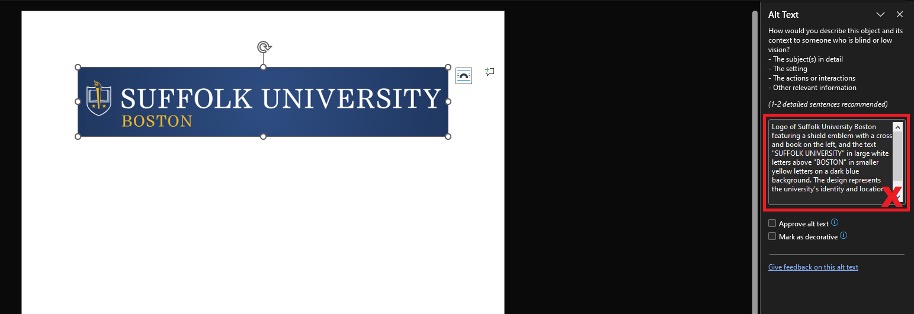
Alt text should primarily focus on usability and avoid flowery descriptions. Be direct and to the point, and don’t hesitate to mark images as decorative if their inclusion isn’t critical to understand your material.
For images of text, alt text should simply be the text in quotation marks. Though try to avoid images of text whenever possible.
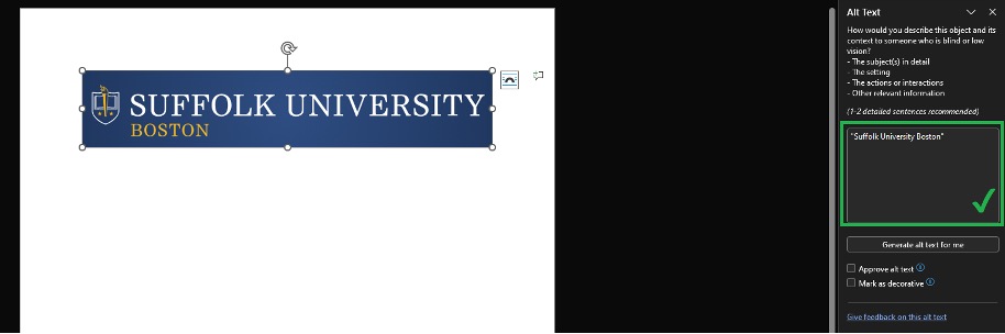
See our suggestions on how to make good alt text on the Accessible Content Guide page.
The easiest way to organize your documents is to use Word’s style bar on the home tab. You can pop this bar out by pressing the popout button, or with the keyboard shortcut (Alt+Ctrl+Shift+S on PC, or Shift+Option+Command+S on Mac IOS):
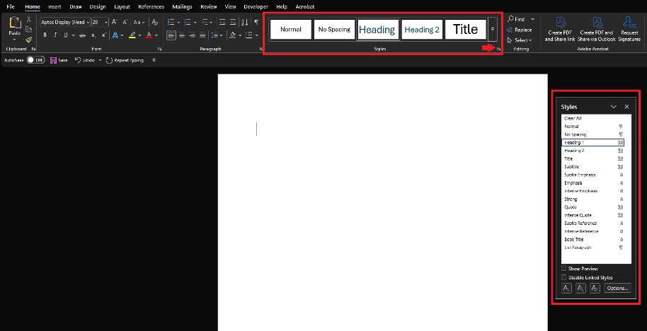
A common misconception is that these styles only affect how your text looks, but using these styles also will make your documents much easier to navigate.
First, configure how your headings look so they fit your document. You can do this by right clicking the heading and pressing modify:
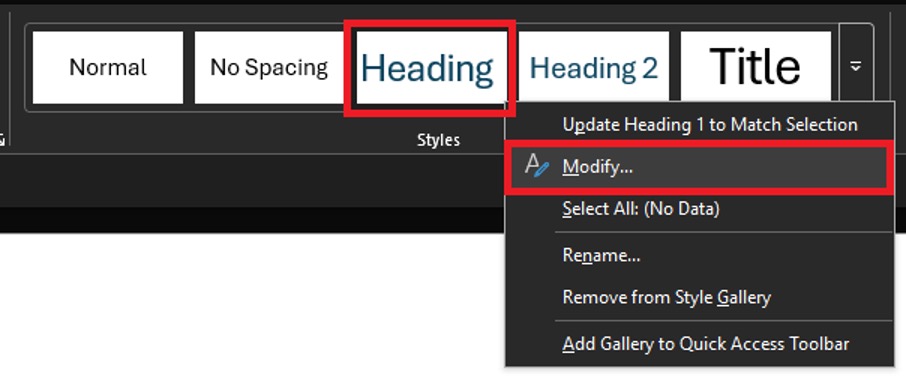
Then, once your headings look good to you, just left click on heading whenever you start on a new section. You can also use the shortcut, Ctrl+Alt+1 or Command+Option+1 for level 1 headings, Ctrl+Alt+2 or Command+Option+2 for level 2 headings, and so on. Headings function like an accordion; a level 2 heading will belong to the most recent level 1 heading so make sure to always use a level 1 heading first.
Once you have headings, students can easily jump between them. To add even more navigational ease, you can also link to your own headings.
Tables generated within Word are automatically accessible, but there are a few things you should keep in mind when using tables.

Word has many ways to customize your text, but here are a few things to keep in mind:
Links in Microsoft Word are a good way to add context to and improve navigation, but the type of links you use matters. Instead of copying and pasting web links directly into your document, transform your text into links by highlighting it, right clicking, and selecting link from the context menu. You can also link to your headings.
Avoid text links like “click here.” Your links should be descriptive and give your students an idea of where the link will take them.